Small rooms are unforgiving about paint. In a big room, a dramatic colour is a backdrop; in a small one, the same colour is on every wall, close to your face, wrapping the whole space — and it can quietly take a metre off the room in every direction. Just as disappointing is the opposite mistake: the timid all-white box that was supposed to feel airy and instead feels cold, stark and somehow even smaller, because every corner and shadow now stands out.
The good news is that colour’s effect on size follows learnable rules: light colours recede, dark and warm colours advance, and contrast draws the walls’ edges — and therefore the room’s true size — to your attention. This guide names the colours that shrink small rooms, explains why, and gives you the safer palette that makes them feel bigger instead.
Quick Answer
The colours that make a small room feel smaller are dark, saturated colours on all four walls and ceiling, strong warm colours (reds, oranges, deep terracotta) in rooms with little light, high-contrast schemes where walls, trim and ceiling are all different, and blue-grey shades in north-facing light, which turn cold and cave-like. Instead, use light-to-mid tones with the trim in the same colour, the ceiling a step lighter, low contrast throughout, and keep deep colours for one wall or small doses — the room’s edges blur, and blurred edges read as more space.
The Colours That Quietly Shrink a Room
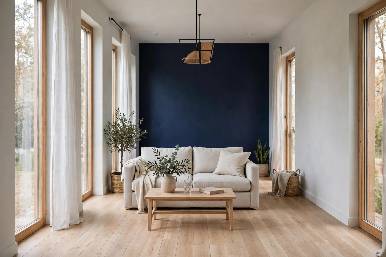
Dark colours on every surface. Deep navy, charcoal, forest green and chocolate brown absorb most of the light that hits them, so the walls stop reflecting the room back to you and the space loses its visual depth. In a large room that creates mood; in a small one it creates a box with the lid on — especially if the ceiling joins in. A dark ceiling is the single most shrinking choice of all: it lowers itself toward you and shortens every wall.
Strong warm colours. Red, orange and rich terracotta are “advancing” colours — the eye reads them as closer than they are. A warm colour on the far wall of a long, narrow room can balance its proportions, but warm colour on all four walls of a small square room makes every wall lean inward. Add weak light and the effect doubles, because warm saturated colours also darken quickly as light falls.
Stark, brilliant white. This is the counterintuitive one. Pure white was supposed to maximise space, but in a small room with modest light it often reads grey and shadowy, and because it contrasts with everything — the floor, the furniture, the door frame — it outlines the room’s small dimensions precisely. Airy white works in bright, sunlit spaces; in a dim box room it produces a clinical cubicle, a cousin of the problem in our guide to a room that feels dark even with the lights on, where the light itself, not the colour, is the missing ingredient.
Contrast: the Hidden Size-Killer
More than any single colour, contrast decides how big a room feels. Every hard edge where one colour stops and another starts is a line your eye traces — and tracing edges is how the brain measures a box. White walls with a dark floor, a coloured ceiling line, bright white trim against mid-tone walls: each boundary announces the room’s exact, small measurements.
Blurring those boundaries is the most reliable enlarging trick there is. Paint the trim, skirting and door in the same colour as the walls (a satin finish on the trim gives just enough sheen difference to read as finished, not forgotten) and the walls lose their outline — the eye slides past the edges instead of stopping at them. Keep the ceiling the same colour or one step lighter, and adjoining spaces in the same palette, and a small flat starts to read as one continuous, larger whole. These are surface versions of the same space-stretching principles behind making a small apartment feel bigger without buying new furniture — sightlines run further when nothing interrupts them.
What to Use Instead: the Enlarging Palette
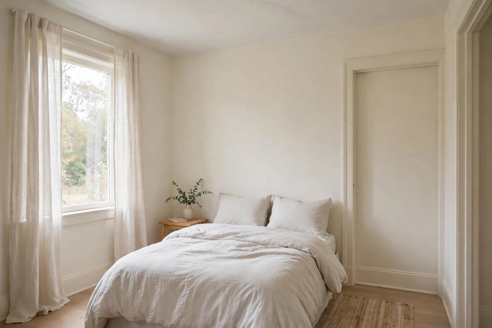
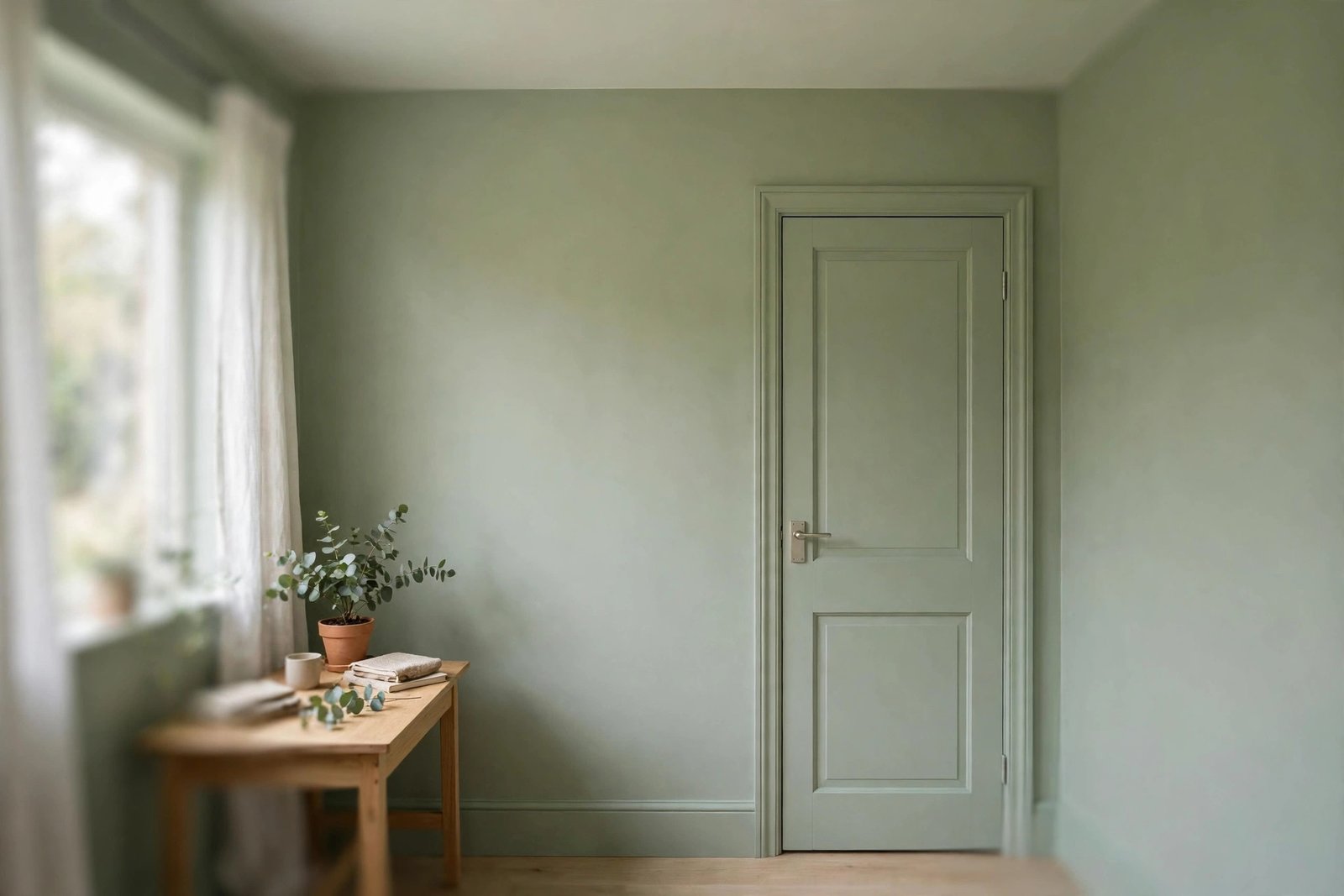
Aim for light-to-mid tones — colours with a light reflectance value roughly between 55 and 80 — in soft, slightly muted versions rather than bright, clean ones. Warm off-whites, pale greiges, soft sage, dusty pale blue and gentle plaster pinks all reflect plenty of light while keeping enough colour to feel like a decision, not a default. Muted matters: a pastel with a little grey in it sits back quietly; the same hue in a clean, bright version jumps forward.
Match the colour to the room’s light, not to the swatch’s name. North-facing and window-poor rooms need warmth in the paint, because their light is blue-grey: warm off-whites, creamy neutrals and soft warm greens stay kind, while blue-greys turn icy and shrink the room by mood. South-facing rooms flooded with warm sun can take cooler colours — pale blue-greys and cool whites will stay balanced. Windowless rooms (hallways, internal bathrooms) break the rules happily: with no daylight to fight, a mid-tone colour plus good warm artificial light can feel cosy rather than small, provided the ceiling stays light.
Whatever you choose, test it at full scale before committing — a colour’s shrinking or enlarging effect only shows across a whole wall, and the undertone surprises in our guide to paint that looks wrong after painting are twice as expensive in a small room, where there is nowhere for a mistake to hide.
Using Dark Colour the Right Way
None of this bans dark colours from small rooms; it bans them from every surface at once. Used deliberately, depth can actually stretch a room: one dark wall at the far end of a long room pulls that wall visually closer and corrects the tunnel shape. Dark colour below a dado line or on the lower half grounds a room while the light upper half keeps the air. Dark inside a bookcase, alcove or the wall behind open shelves creates a pocket of depth that reads as extra space, not less. And a small room with genuinely good light — a bright south-facing box room — can carry a full deep colour if the floor, ceiling and textiles stay light and the lighting is warm and layered; the effect is a jewel box, not a cave. The rule is proportion: dark as an accent is depth, dark as the whole envelope is shrinkage.
Mistakes to Avoid
- Painting the ceiling dark in a small room. It lowers the ceiling visually and shortens every wall — the fastest way to shrink any space.
- Defaulting to brilliant pure white. In weak light it turns grey, shows every shadow and outlines the room’s small size. Warm off-white is almost always better.
- High-contrast trim. Bright white woodwork against coloured walls draws a frame around each wall and measures the room for your eye. Match trim to walls.
- The random accent wall. A single deep wall chosen at random — especially behind the sofa where you face away from it — adds contrast without depth. Dark walls belong at the far end of the sightline.
- Choosing from a tiny swatch. Shrinking colours reveal themselves at wall scale. Test a big board on two walls before buying the full amount.
- Ignoring the light’s direction. A pale blue-grey that sings in a sunny room turns cold and cave-like facing north. The room’s light chooses the undertone.
Frequently Asked Questions
Is dark paint always wrong in a small room?
No — dark paint everywhere is wrong. One dark wall, a dark lower half below a dado line, or dark colour inside alcoves and shelving adds depth that can make a room feel more interesting and, in the right spot, larger. A bright small room can even carry a full dark scheme if the ceiling, floor and textiles stay light. What shrinks a room is a dark ceiling and four dark walls in weak light.
Should the ceiling be the same colour as the walls?
In a small room, yes or one step lighter — both work. The same colour blurs the wall-ceiling edge so the room’s height is not measured by a hard line; one step lighter keeps a gentle sense of lift. What matters is avoiding contrast: a bright white ceiling over mid-tone walls draws a lid on the box and emphasises the room’s edges.
What is the best colour for a tiny north-facing room?
A warm off-white or soft warm neutral with a light reflectance value around 65–75 is the safest answer — creamy whites, warm greiges and pale warm greens all counteract the blue-grey northern light. Avoid blue-based greys and cool whites, which the light will push colder and darker than the swatch promised.
Does painting the trim the same colour as the walls really help?
Yes, measurably in feel if not in centimetres. Contrasting trim outlines every wall and doorway, and your eye reads those outlines as the room’s dimensions. Same-colour trim (in a slightly different sheen) removes the outlines, so sightlines run to the corners unimpeded and the room reads calmer and larger. It also makes the woodwork look intentionally modern rather than unfinished.
The Bottom Line
Small rooms shrink under dark, saturated, warm or high-contrast colour — and under stark white in poor light, too. They grow under light-to-mid muted tones, blurred edges, matched trim and a ceiling kept light. Keep deep colour as a placed accent rather than the whole envelope, choose the undertone for the light your room actually gets, and test at wall scale. The room will not gain a centimetre — it will simply stop confessing how small it is.
4 thoughts on “Small Room Paint Colours That Make It Feel Smaller (And What to Use Instead)”